As an AV Integrator, one of the key elements of every system is visual reinforcement. Although you may be able to get away with picking pieces from a list and throwing them together, sometimes the requirements of the project call for a more in-depth design approach. This article will focus on how the visual aspect of the project can be intelligently designed.
What kind of Display
You will have a choice to make between a projector/screen combination or a flat panel display. One of the deciding factors that may force one choice over the other is the required screen size (see how to calculate this a bit farther down). The cost per inch of a projector/screen at this point just can’t be matched by a flat panel display.
One of the advantages of a flat panel over a projector (assuming the screen size is adequate) is the lower maintenance and longer lifespan. You will also have quicker power-up times, and typically a brighter better contrast image. Another benefit is less noise in the room.
Projector: Competing Technologies – DLP/LCD
There are two main projector technologies (circa 2011). LCD and DLP both have their strengths and weaknesses and you have to understand there are fundamental differences in how the two produce colors on screen. LCD is based on having light pass through LCD panels acting as red, green, and blue “filters”. A prism combines the light just before it hits the lens to produce a full color image.
DLP (a trademark of Texas Instruments) uses a chip of mirrors to pass or deflect light. DLP light engines come in two flavors: single chip and 3 chip. The 3 chip is much more expensive and creates colors much the same way as LCD with seperate red, green, and blue chips either passing or deflecting away the light. This allows a 3 chip projector to produce an infinite number of colors. Single chip DLP uses a color wheel to selectively choose the color of light to pass to each pixel on the chip. This is a much more affordable technology, but comes with the disadvantage of having a finite number of colors that it is capable of producing.
If you are trying to color match with LCD desktop monitors, you do not want to use a single chip DLP projector.
There are other differences concerning lifespan and maintenance between DLP and LCD, but I will leave them for another article.
Flat Screen: Competing technologies – Plasma or LCD LED
First of all, LED is not really a display technology unless you are talking about an LED digital sign where the pixels are comprised of actual LEDs. What manufacturers are referring to with LCD LED monitors/TV’s is that the back lighting is LED. With a LED backlight grid, the TV can be dynamically lit or dimmed based on the color of the pixel in a specific area. Simply put, this lets LCD TV’s produce blacker blacks as the backlight is essentially turned down behind the pixel areas that are black on the image.
After saying all this, the traditional difference between LCD and Plasma was the ability to produce true blacks. Think of Plasma as a miniature LED sign, with the light being produced at each pixel. LCD uses backlight which shines through a filter to produce a pixel onscreen. (similar to LCD but each pixel has it’s own RGB grid)
Plasmas tend to run hotter, and do still have some burn in issues with static content, although this has been improved with advanced design and settings that can add some movement to the screen occasionally. You should refer to manufacturers on how to set this up on Plasma screens you are installing to avoid the burn in from happening.
LCDs do have a bit of “image retention” with static content, but this tends to go away when the power is cycled.
Viewing Distance
One of the factors that can help you decide the type of display is the viewing distance as this has an affect on the overall size of the image. There are a number of different methods to determine what the proper viewing distance should be, some being very technical and others more of a rule of thumb. The reason for the variance is really derived from the type of content displayed. Motion video with no text is a lot more forgiving. For example, watching a video image at a sports bar – while it is nice to have a BIG screen, you can be comfortable watching on something much smaller and still understand what is going on. That being said, with the smaller screen you may struggle with the on-screen stats and text based information.
Regardless of the content, you want the viewers of your image to be able to see it comfortably. In the design, you shouldn’t have viewers any closer than 1 x the screen width.
Distance for Video Content
A nice rule of thumb for maximum comfortable video viewing distance for general video is 8 times the display’s image height. So for a 55″ Monitor (26.94″ high), you wouldn’t want anyone further than 215.52″ (17.96 feet). This isn’t a published specification but we have found it to be a reasonable approximation. If anyone has a more thorough calculation for video viewing distance, please let everyone know in the comments below and we will modify this section of the article.
Distance for Text Content
95% of the jobs we work on are in a corporate environment where people use a display on a daily basis to show presentations from a computer, typically powerpoint or excel. While some of these presentations are more video related, you can assume there will be text shown on the screen. In this situation, you want a much bigger image to allow people to read the content comfortably without eye strain. This will help to keep the audience more engaged in the presentation without losing interest.
The screen multiplier calculation that I discussed for video can also be used here. You can assume a factor of 6 times the image height for detailed viewing and Powerpoint presentations. A factor of 4 times is needed for close inspection viewing of complex information.
While the screen multiplier calculation can get you close, sometimes we like to use a more detailed method based on the size of the fonts being used. This will require us to make some approximated guesses (the customer will typically not have this information)
- Excel: Assume 11 points (Excel font size can be changed by clicking the “ribbon” button and choosing “Excel Options”)
- Powerpoint: Assume 32 points. (In reality this size can vary widely)
The computer resolution will also be needed, this could be XGA (1024×768), 1080p (1920×1080) or a wide variety of others. For the distance calculation we will be using the height of the image in pixels.
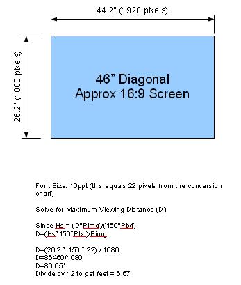
A recommended maximum distance for comfortable viewing of text is 150 times the text height. While you don’t have to stay in this range it will provide the most viewable content if the environment permits. You can calculate this out using cross multiplication, but to make it easier we have derived a fairly simple algebraic formula. You can rearrange this as you need to solve for any variable. In this case we want to know the minimum screen height given a maximum viewing distance. This number could be taken off a furniture plan showing where the farthest person would sit in relation to the screen.
The calculation tells us that you would want a screen with a height of 102.4″ to be able to comfortably read excel spreadsheets from 25′ away. Since a typical room is 8′ high, it is obvious that there will be some creativity required to make this scenario work. It is probably unrealistic to expect people in a regular meeting room to read excel from the back of the room. You have options of putting in additional displays (perhaps on the table) or mounted in the ceiling. It could also be explained to the client that they could use larger font size if needed for readability.
Here is another example, using a modified version of the above formula to caluclate D, the recommended maximum viewing distance.
Viewing Angle
This aspect of the design is a bit simpler to explain. Basically you want to keep your viewers within 45 degrees to each side from center of the screen. You also need to make sure the top of the screen is within 30 degrees up from the viewer to avoid strain. Again as with the distance calculations, if you are a bit off with this it will still work but you should note the compromise in design so your customer knows what to expect.
Aspect Ratio
4:3 used to be the standard for Pro AV and that is why XGA (1024×768) is still very commonplace in the industry. It seems that the aspect ratio is really driven by what the computer manufacturers are doing. Several years ago, we started seeing computer monitors start to emulate widescreen TVs and come with wider resolutions, such as 1366×768 or 1280×800. The Pro AV industry followed suit with widescreen projectors and screens. For optimum viewing, your display device should be capable of displaying PC content in the native resolution and aspect ratio – otherwise content will appear stretched and/or blurry from being scaled. The most common wide screen aspect ratios are 16:9 and 16:10. Look for more discussion on interchanging the different aspect ratios in future posts on the site.
Your Input
If you have any tips on how you calculate some of the things discussed here, please leave a comment below and let us know.
Note – AVDistanceCalc is an iPhone and Android app that was created by our team to help you perform the calculations discussed in this article.


